CASE STUDY / DISTILLERY BRANDING
Branding and label design for a craft distillery and spirits range.
Involvement
- Brand identity
- Ideation
- Label design
- Packaging design
- Brand guidelines
Branding and label design for Yorkshire Dales Distillery. A family-run craft distillery that produces unique spirits, which perfectly encapsulate the essence of Yorkshire.
The design challenge
Yorkshire Dales Distillery already had an existing range of high-quality spirits made from botanicals sourced locally from their stunning surroundings. However their existing branding didn’t do their products justice and neglected to reflect the charm and elegance of the liquid. The challenge was to reposition their high-quality spirits by highlighting the flavour profile and putting them back on the map.
The design solution
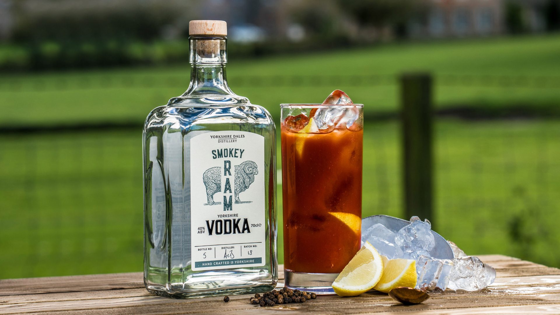
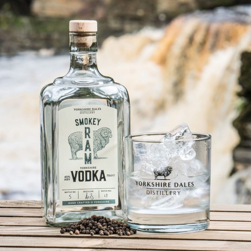
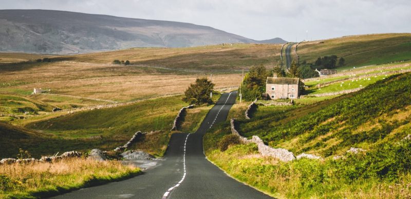
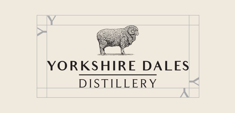
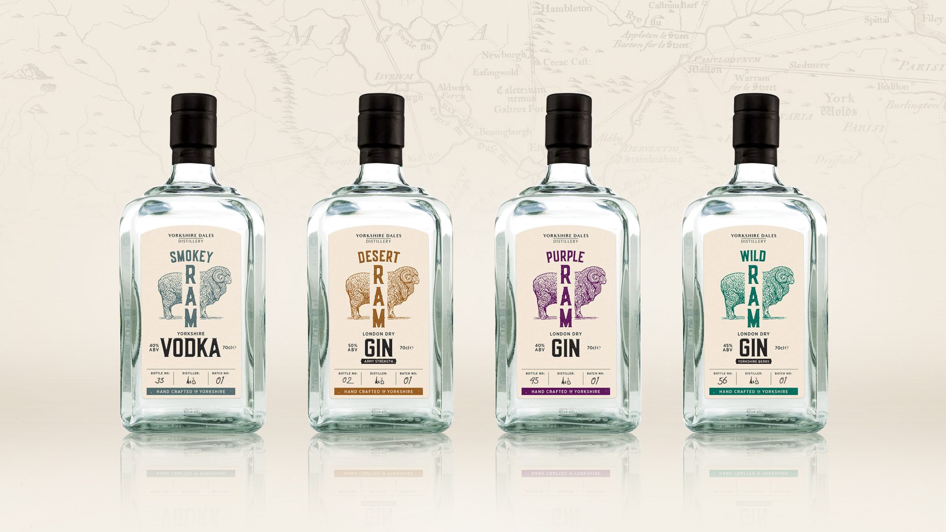
The solution was to dial up the provenance within the label design, in order to celebrate the brands point of difference – being from the beautiful Yorkshire Dales. The ram is an iconic symbol of Yorkshire which featured on their previous label and needed to be an integral part of their new brand identity. The overall label was simplified to give a more confident and modern feel to the brand. Inspiration for the colour palette came from the beautiful landscapes of the Yorkshire Moors and aimed to suggest liquid flavour profile. Finally the distillers signature and batch number were added to each bottle to suggest the craft nature of the spirits and distillery process and enforce product authenticity.
Project completed via: Designmatic
Get in touch
Interested in finding out more or working together on a project?
I’d love to hear from you, lets talk about your project.
t: +44 (0) 7813 452100
e: hello@laracaiulodesign.co.uk
