blog / Packaging
Crafting the Perfect Whisky Label: Tips for Stand-Out Bottle Presentation
5th March 2024/Categories: Packaging, Spirits
The first interaction with a whisky label shapes the initial impression, blending elements of artistry, regulatory compliance, and marketing strategy inherent in every bottle. This guide looks into the essential steps for crafting the perfect whisky label—from creating designs that captivate attention to navigating legal requirements and exploring methods for personalising the label to align with your brand and consumers. For those venturing into the world of whisky, this blog aims to steer you in the right direction.
Key Takeaways
- Crafting the perfect whisky label combines typography, colour, and imagery to narrate the brand’s story, evoke emotions, and stand out visually, offering consumers a prelude to the sensory experience of the whisky.
- Material selection and printing techniques are crucial for the label’s aesthetic and durability; options range from classic paper to resilient vinyl, with digital and flexographic printing catering to different production scales.
- Customisation options such as die-cut shapes, foil stamping, and embossing provide whisky bottles with a unique and memorable identity, enhancing the tactile and visual experience for the consumer.
Crafting the Perfect Whisky Label
A whisky label does more than simply adhere to a bottle. It narrates the brand’s story and encapsulates the spirit’s essence in a way that entices consumers and sets the stage for the forthcoming sensory experience. The first encounter a customer has with a whisky bottle is visual, making a well-executed and visually arresting label crucial in crafting a design that grabs consumer attention. The elements of a whisky label – including the typography, colour scheme, and imagery – work together to create the overall brand. The choice of typeface can evoke nostalgia or sophistication; the colour palette can mirror the whisky’s hues or contrast them to stand out; and the imagery can be a nod to the brand’s heritage or a bold, modern statement.
Typography: The choice of typography plays a pivotal role in shaping the ambiance of the label design. It can serve as a prominent feature, reflecting the deep-rooted heritage of the distillery, or seamlessly complement imagery or photography. For example, vintage-inspired or refined script fonts can evoke tradition, while bold, sans serif fonts may convey a sense of contemporary style.
Colour scheme: Colours wield significant influence in the realm of whisky, with earthy tones, rich browns, and deep reds often mirroring the liquid’s hue or maturation. Alternatively, bolder or contrasting colours may signify heritage or serve to captivate consumer attention. For instance, Jameson Irish Whiskey utilises a rich green colour palette to evoke its heritage.
Imagery: The inclusion of imagery enhances the label’s visual appeal. It can make a bold statement, occupying ample space with engraving-style illustrations, or take a more subtle approach through brand logos or iconic symbols elegantly positioned on the label or as secondary decorative elements. The Macallan, for example, is renowned for its distinctive label that incorporates engraving-style illustrations, adding a classic and sophisticated look to the product.
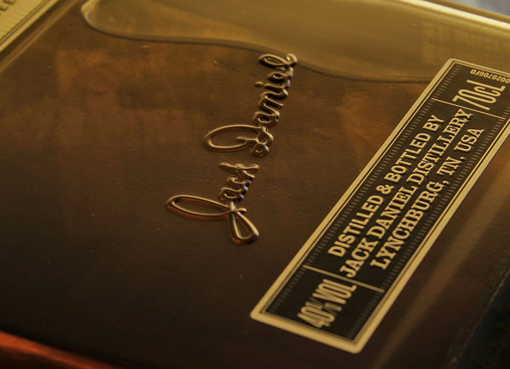
Typography Choices on a Whisky label
Typography, or the artful arrangement of type, is instrumental in crafting the perfect whisky Label that catches the eye and effectively communicates the brand’s core identity. Specific typefaces can stir feelings of nostalgia and exude a vintage vibe, making them ideal for representing the brand’s heritage.
However, for a more elegant label, fonts like Aurora Script, inspired by traditional calligraphy, are suited for whisky labels that target a more luxurious market niche. On the other hand, classic fonts like Civane and TT Octas offer a blend of traditional style with modern adaptations, such as upright italics and angled forms, which enhance readability and aesthetic presence on whisky labels.
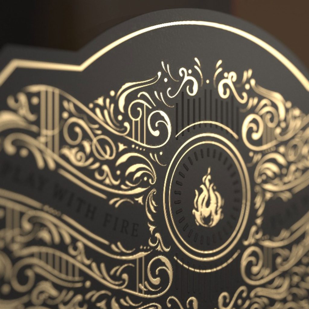
The versatility of typography allows brands to mix and match fonts, providing versatile options for creating a coherent brand identity for whisky like the image below. Choosing a graphic designer with experience in brand creation for the whisky industry would be crucial in helping you make that decisions and determining what works for your brand.
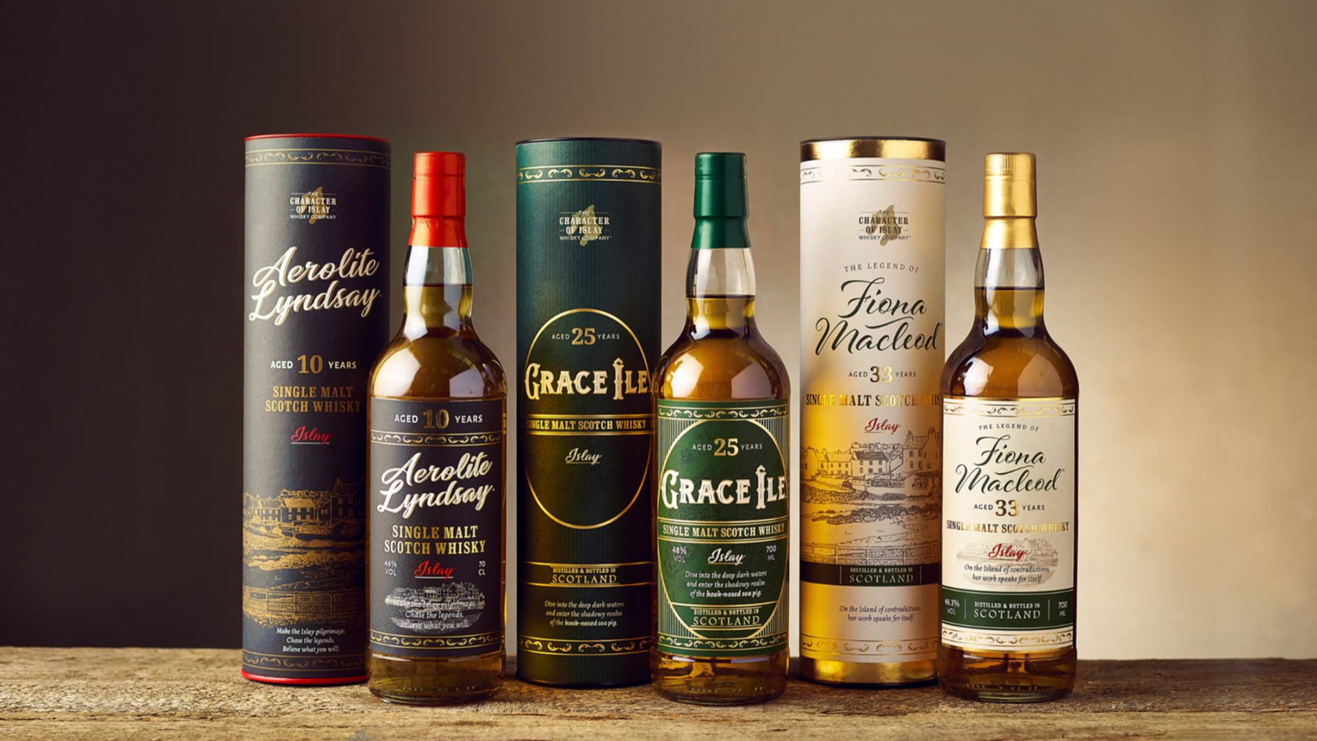
Colour Schemes
A whisky label’s colour scheme can reflect the spirit’s inherent hues, resulting in a visually unified presentation that boosts its appeal among consumers. Labels can feature a range of brown shades that parallel the aging process of whisky, serving as an indication of its maturity and flavour depth. Dark, muted colours are strategically chosen to convey a feeling of sophistication and to ensure that the bottles stand out among lighter-coloured products on retail shelves.
Moreover, colours can hint at the whisky’s flavour notes, offering a subtle cue to the contents within. For instance, a hint of gold could suggest notes of honey, while deep reds could indicate the presence of rich, fruity notes. The thoughtful selection of colours can thus enhance the consumer’s perception and understanding of the whisky, which is why it’s a crucial step to consider when crafting the perfect whisky label.
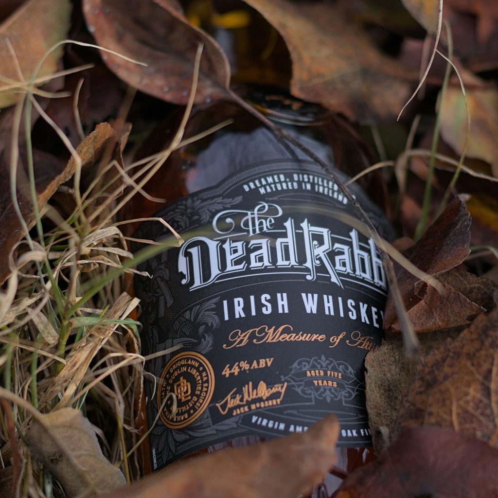
Imagery and Graphics
Incorporating imagery and graphics into a whisky label can heighten its visual intrigue and make it more engaging and memorable for consumers. Some ideas for incorporating graphics into a whisky label include:
- Vintage-inspired graphics, resonating with old medicinal labels or apothecary aesthetics
- Motifs such as animals, objects or places to create a distinctive narrative for the brand
- Graphics that glow under specific lighting, adding an interactive visual appeal
- Crosshatching and woodcut techniques, to deliver a handcrafted impression that reflects the artisanal quality of the whisky
These graphic elements, created as your own artwork, can enhance the uniqueness and memorability of the whisky label.
On the other hand, modern whisky labels often favour minimalistic graphics, adopting clean designs that break through the cluttered shelf space, appealing to contemporary consumers. However, the classically inspired engraving-style illustrations remain a popular graphical element on whisky labels, signifying sophistication and a timeless brand image.
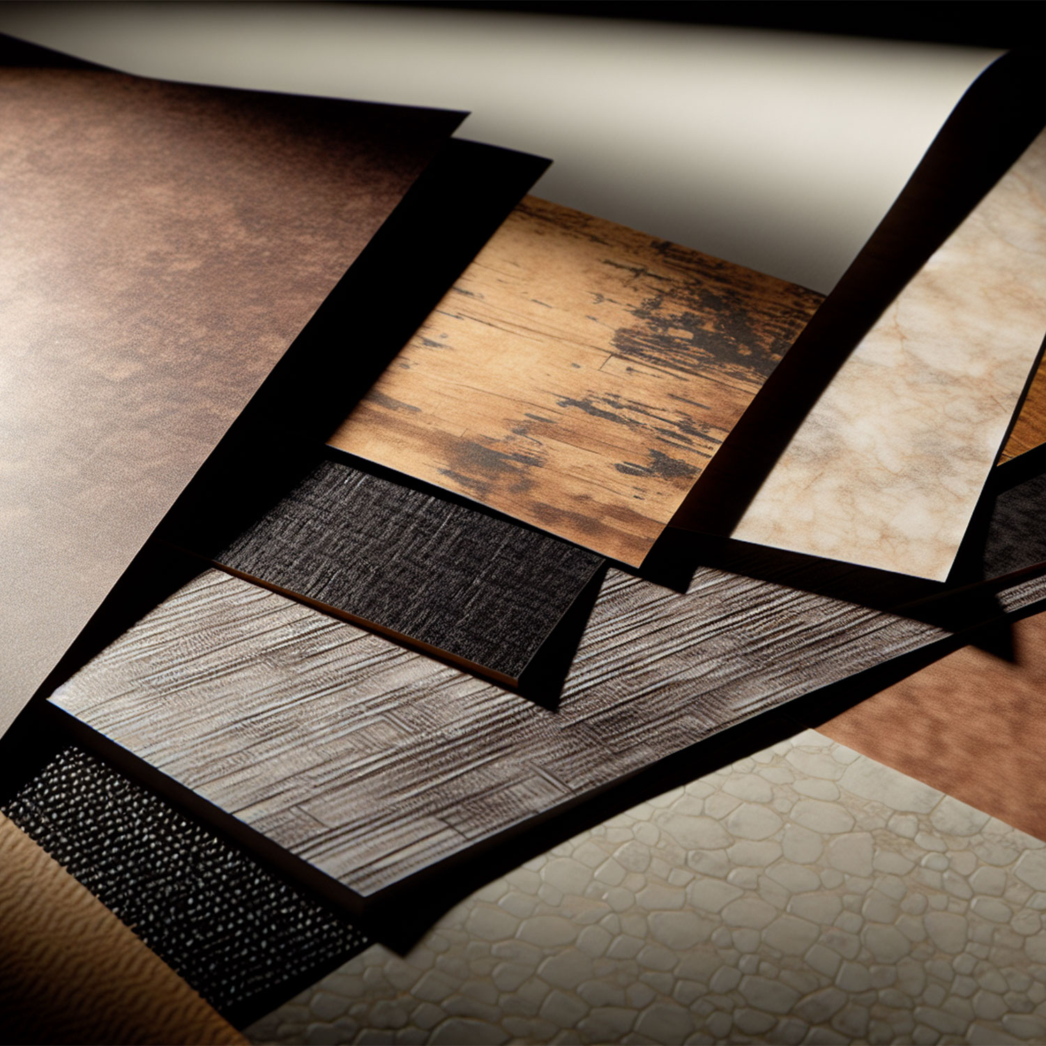
Material Selection for Whisky Labels
Whisky labels can be crafted from a diverse range of materials, each providing unique aesthetic and practical benefits. The selection of material can significantly impact the label’s overall aesthetic and tactile experience, introducing depth and texture to the design. Common materials include paper, vinyl, and textured options, each catering to different aesthetic and functional preferences.
The quality of the materials and inks used for printing labels is crucial to ensure durability, visual quality, and adherence to the bottle. This is especially important for whisky bottles, which could be exposed to different environmental conditions over the course of their shelf life.
Paper Labels
Paper labels are often chosen for whisky bottles due to their classic appearance. They offer a wide range of finishes and textures that can enhance the label’s visual appeal. From glossy finishes that shine under the light to matte finishes that offer a more understated elegance, there’s a paper label to suit every brand’s aesthetic vision.
Moreover, textured paper labels (un-coated stock) with an off-white finish are popular for creating a traditional whisky label look that promotes luxury. These labels not only catch the eye but also appeal to the sense of touch, inviting consumers to engage more deeply with the product.
Vinyl Labels
Vinyl labels offer another excellent option for whisky bottles. They are resistant to moisture, making them an ideal choice for whisky bottles that could be exposed to different environmental conditions. This durability ensures that the label remains in pristine condition, preserving the brand’s image even under challenging circumstances. Though may be more suitable for a modern whisky label as it doesn’t quite contain the same level of luxury.
A variety of finishes can be chosen for vinyl labels, including:
- white
- clear
- metallic
- crystal frost
This flexibility allows brands to create labels with multiple designs that truly reflect their vision and resonate with their target consumers.
Textured Labels
Textured labels can signify style and class, enhancing high-quality whisky branding with their luxurious appeal. These labels are particularly effective when used with whisky bottles that already possess a distinctive character, complementing rather than creating uniqueness.
In addition to aesthetic value, textured labels can align with ecological values, offering sustainability without compromising affordability for whisky producers. The range of textures available for whisky labels includes matte finishes that absorb light, velvet feels that enrich colour depth, and parchment touches for a rustic effect. Each texture offers a distinct tactile experience, contributing to a more engaging interaction with the product.
Matte textures offer a sleek, minimalist look and are less prone to showing fingerprints, appealing to brands with a modern aesthetic. Velvet textures are smooth to the touch and present colours in a deeper, richer manner compared to matte finishes. Meanwhile, parchment textures create a natural, wood grain-like appearance, introducing a sense of heritage and craftsmanship to the whisky bottle.
Customisation Options for Your Whisky Label
Tailoring a whisky label is a key strategy for distinguishing the product on the shelf and heightening its allure for consumers. A well-thought-out customisation can turn an ordinary label into a work of art that reflects the brand’s personality and the spirit’s unique qualities. Let’s explore some of the popular customisation options that can truly set a whisky label apart.
From die-cut shapes and foil stamping to embossing, these techniques add depth and visual interest to the label, making it more engaging and memorable. These finishing options complete the custom look, turning every bottle into a testament to the brand’s attention to detail.
Die-Cut Shapes
Die-cut shapes offer a simple yet effective way to enhance the visual appeal of whisky labels. By moving away from standard rectangular labels, brands can create a unique silhouette that stands out on the shelf. Die-cutting shapes can range from simple geometric forms to intricate patterns that reflect the brand identity or theme of the whisky, allowing for high levels of customisation.
The beauty of die-cut shapes lies in their ability to create an instant visual impact. A well-executed die-cut shape can lend an air of sophistication and exclusivity to a whisky brand, catching the eye of discerning consumers and leaving a lasting impression.
Foil Stamping
Foil stamping is another powerful customisation option that can add an aspect of elegance to your whisky label. This technique involves the application of metallic foil, resulting in a design that catches and reflects light, providing a whisky label with a distinct shine that elevates the product’s luxury appeal.
Hot foil stamping is a versatile decoration technique for whisky labels, capable of producing various effects including shiny metallic, eye-catching holographic, and sophisticated matte finishes, enhancing the perception of luxury. The glittering effect of foil stamping can make a whisky bottle stand out on the shelf, attracting attention and inviting closer inspection.
Embossing
Embossing is a technique that creates a raised 3D effect on the label, often used on luxurious goods to add a level of uniqueness. This tactile element enhances the sensory experience of handling a whisky bottle, contributing to a more engaging interaction with the product.
High-build silk screen is a finishing technique that can be combined with embossing to add an extra glossy pattern that is raised above the rest of the whisky label design. The resulting texture not only looks visually appealing but also feels satisfying to touch, further enhancing the consumer’s connection with the product.
Whisky Label Printing Techniques
Upon finalising the design, the next step is to actualise the whisky label through printing. The selected printing technique can considerably affect the label’s overall quality and visual appeal. Two of the most common printing techniques used for whisky labels are digital and flexographic printing.
Digital printing delivers a quick turnaround time as it doesn’t require separate plates for each colour, cutting down setup time. It’s particularly cost-effective for smaller print runs due to the absence of plate-making and related setup costs, and supports short-run capabilities, allowing the production of small custom label batches on demand.
On the other hand, flexographic presses have several advantages:
- They are durable, with long-lasting parts and consumables, which contributes to cost efficiency for large-scale production.
- They permit printing on diverse substrates using various inks, such as water-based, UV curable, and solvent inks.
- Advancements in flexographic printing technology enable high-quality label production with minimal operator management.
Despite lengthy initial setup times, flexographic printing offers rapid production rates and the ability to perform additional processes like varnishing and die cutting in-line, optimising high-volume printed label production.
Legal Requirements for Whisky Labels
While creativity and aesthetics are pivotal in crafting whisky label designs, adherence to legal regulations governing distilled spirits labeling is equally vital. It is imperative for all whisky labels to comply with specific guidelines to ensure accurate and standardised information for consumers. Collaborating with a spirits compliance specialist can help guarantee that your whisky label meets all legal requirements. However, grasping the fundamentals is essential, as it may slightly constrain the design approach for your label.
• The category name, such as ‘Blended Malt Scotch Whisky’ or ‘Single Malt Scotch Whisky,’ must be prominently featured on both the label and packaging. It should be displayed in a clear, easily legible font, with each word given equal prominence and not obstructed by other text or images.
• Regarding age statements on whisky labels, it is crucial to reference the youngest whisky in the blend. For instance, if the youngest whisky in your blend is 10 years old, you may state ‘Aged 10 years’ or ‘Over 10 years old.’
• Numerals, dates, or terms indicating periods of time should be avoided on labels, packaging, or advertising if they could be misconstrued as an age statement or distillation date.
• In the UK, whisky labels must include a sales denomination or legal name, the relevant category name if applicable, and may substitute or complement the sales denomination with a UK or EU-registered geographical indication.
For information on the rules and regulations can be found here.
Iconic Whisky Bottle Designs
Merely creating an aesthetically pleasing label isn’t enough. Your branding requires strategic consideration to position your brand effectively within the market, resonating with your target audience and conveying your brand narrative in a compelling manner. Thoughtful design plays a pivotal role in capturing attention, particularly if you’re entering the whisky realm without an established heritage or reputation.
To fully grasp the artistry involved in whisky label design, examining some iconic whisky bottle designs that have captivated both connoisseurs and casual drinkers is worthwhile. These bottles showcase the power of thoughtful design, embodying their brand’s identity and leaving a lasting impression on consumers.
For instance, the Sexton single malt whiskey features a striking hexagonal shape and opaque black bottle with dark copper script inspired by gravestones and the Giant’s Causeway. RyeLaw from InchDairnie Distillery’s unique bottle has three ripples representing their philosophy and a side-placed label for an unobstructed view through the liquid. The Highland Park Loki, a scotch whisky, is distinct with its bottle presentation in a wooden frame that evokes the shape of a Viking longship. Each of these whisky bottles is a testament to the power of creative label design in enhancing the overall appeal of the whiskies, making them a must-try for any whisky enthusiast.
Summary
Crafting the perfect whisky label is indeed a delicate blend of art, science, and legal compliance. From choosing the right typography and colour palette to selecting the appropriate material and printing technique, every element plays a vital role in creating a label that not only catches the eye but also resonates with the brand’s identity and the spirit’s character. Customisation options like die-cut shapes, foil stamping, and embossing can further enhance a label’s uniqueness, making it truly memorable. While adhering to the legal requirements ensures that accurate and standardised information is presented to the consumer. So, the next time you pick up a bottle of whisky, take a moment to appreciate the artistry that has gone into designing its label.
Are you seeking a skilled graphic designer to elevate your whisky brand’s identity through captivating branding and packaging? Or perhaps you’re in search of a distinctive label design to make a lasting impression in the bustling market? Contact me today to schedule a consultation and kickstart your brand! View my portfolio here.
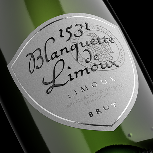
Elegant label design and crafted packaging concepts for Tesco Finest Wines.
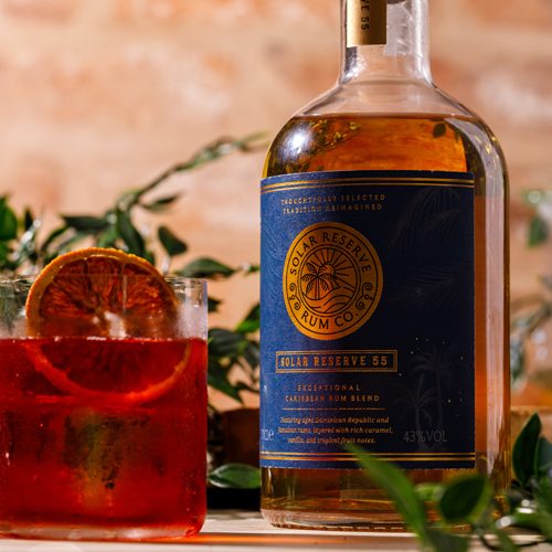
Rum label design and branding for Solar Reserve Rum, created for a modern spirits brand.
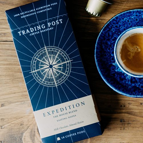
Premium coffee packaging design for Trading Post Coffee Roasters.
Get in touch
Interested in finding out more or working together on a project?
I’d love to hear from you, lets talk about your project.
t: +44 (0) 7813 452100
e: hello@laracaiulodesign.co.uk