CASE STUDY / BOURBON BRANDING
Crafting Branding and Packaging Design for Aged Bourbon Whiskey.
Involvement
- Brand creation
- Ideation
- Label design
- Packaging design
- Brand communications
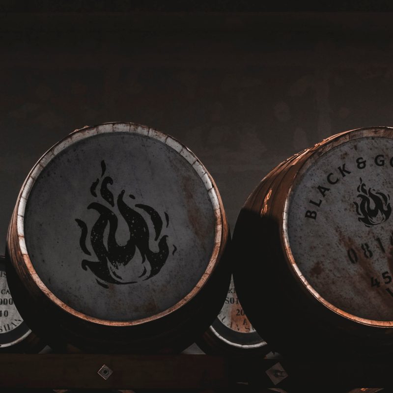
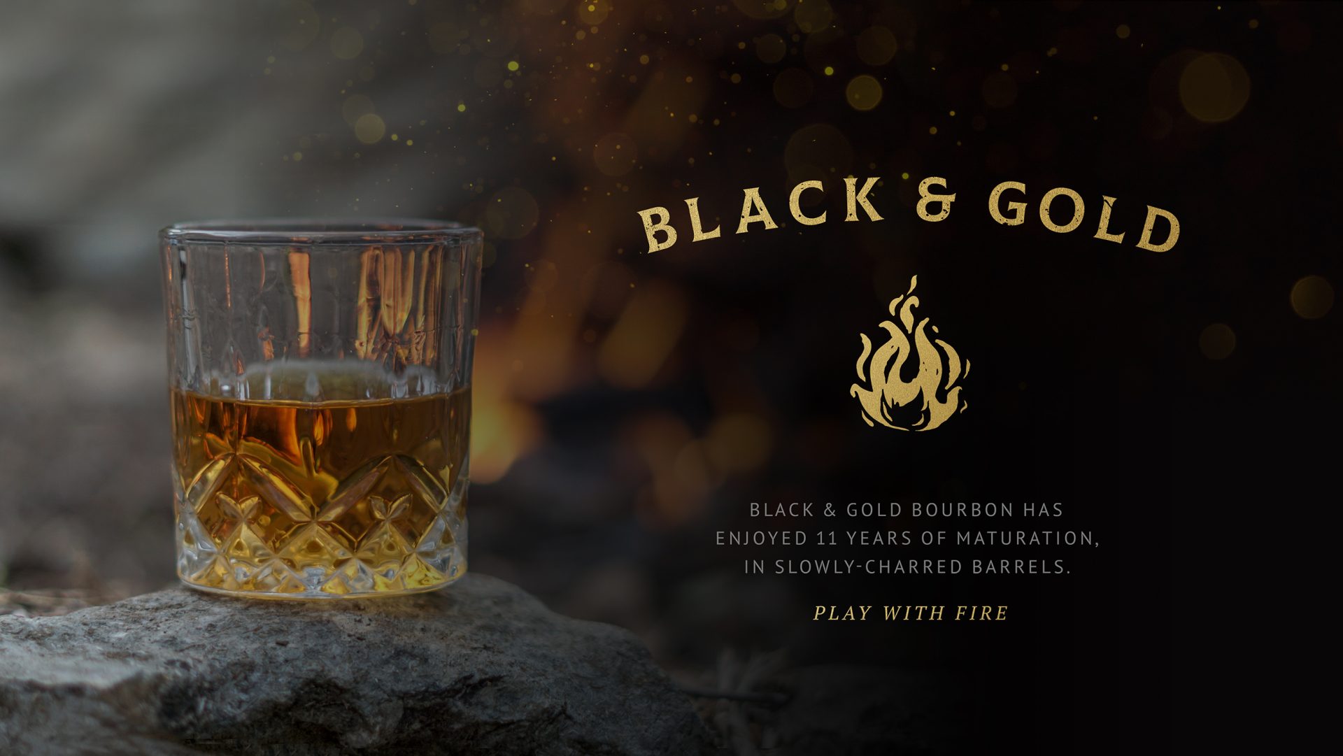
Black & Gold required branding and packaging design for its 11-year-old Bourbon. Aged in slowly-charred barrels, this whiskey develops a rewarding and complex flavour profile.
The design challenge
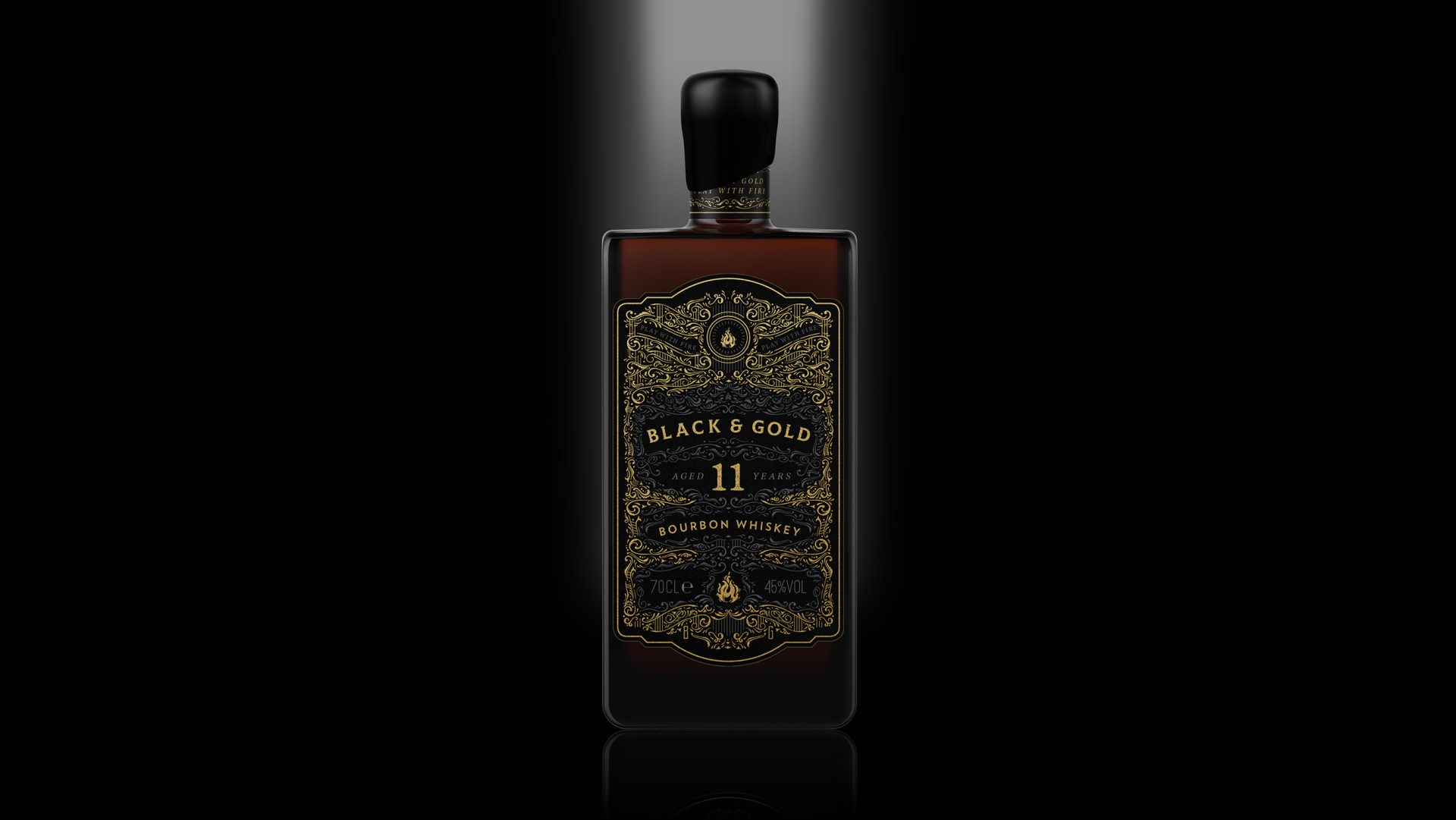
The design challenge encompassed crafting a distinctive brand identity that embodies the essence of Black & Gold, emphasising the significance of fire in the production process. The liquid undergoes slow aging in charred barrels, resulting in a unique flavour profile characterised by notes of brown sugar, vanilla, and rich cigar box. Communicating the complexity of these flavours through branding, packaging and label design was essential. Additionally, the design needed to exude luxury to align with its high price point of £59.95.

The solution
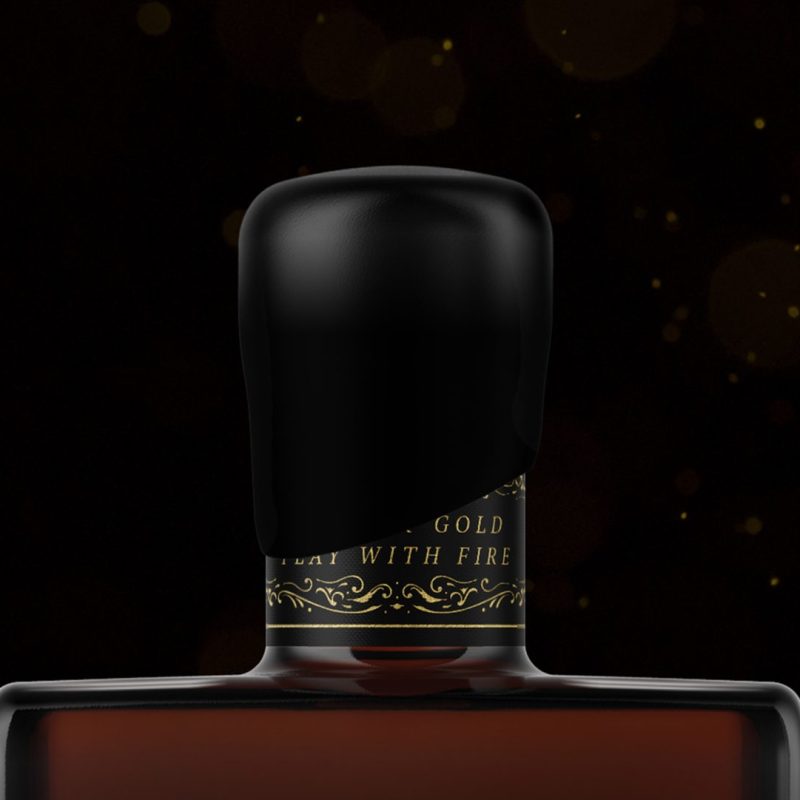
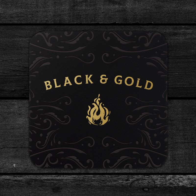
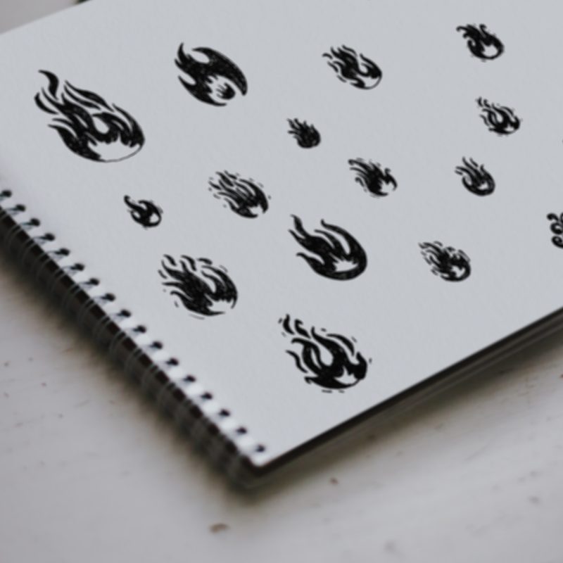
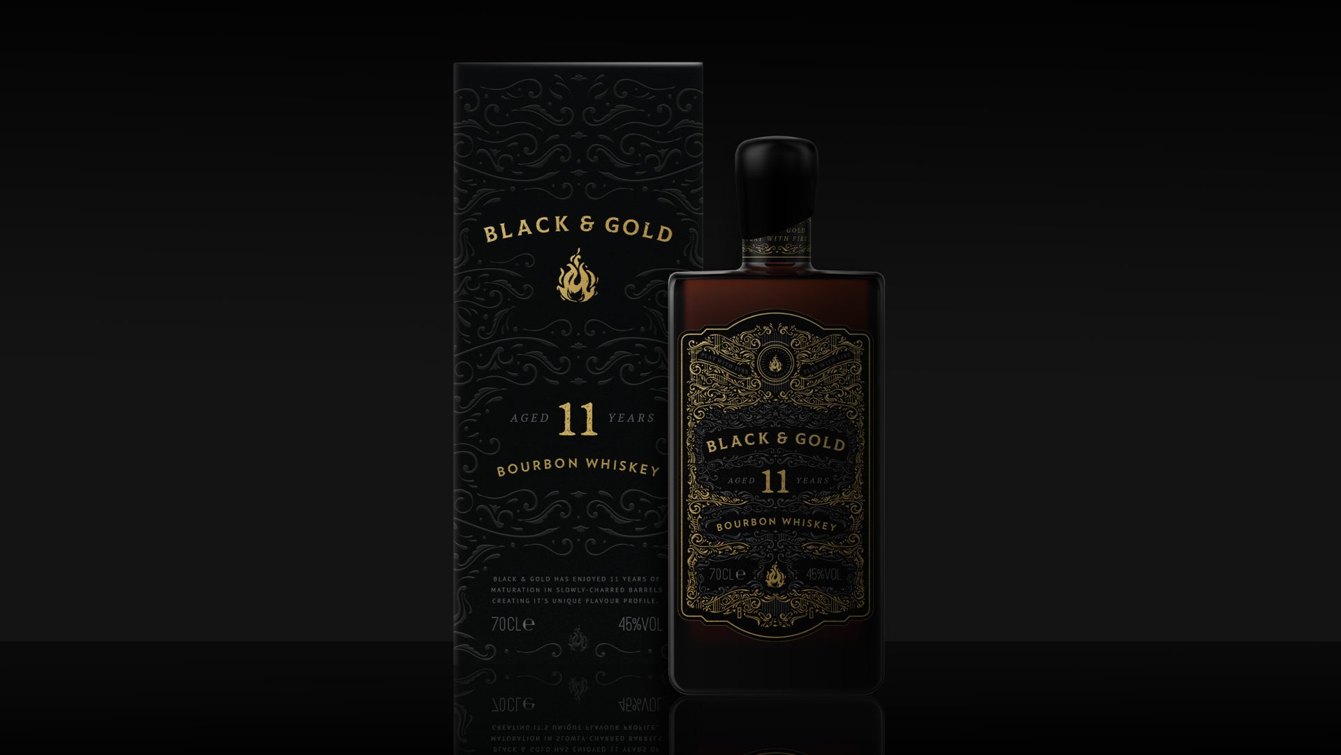
The solution involved amplifying the brand narrative of Black and Gold. Therefore, the packaging design needed to be distinctive and communicate to consumers why this product deserved a place in their Bourbon collection. A hand-illustrated fire brand-mark was created, complemented by a unique decorative pattern designed to intertwine with the typography on the bottle. The intricacy of the pattern pays homage to the exceptional craftsmanship in Black & Gold’s production process. Gold foil and spot UV were then incorporated into the final label design, enhancing tactile sensations and further evoking the brand’s narrative of light and movement.
Project completed via: Atom Group
Get in touch
Interested in finding out more or working together on a project?
I’d love to hear from you, lets talk about your project.
t: +44 (0) 7813 452100
e: hello@laracaiulodesign.co.uk
