CASE STUDY / WHISKY REBRAND
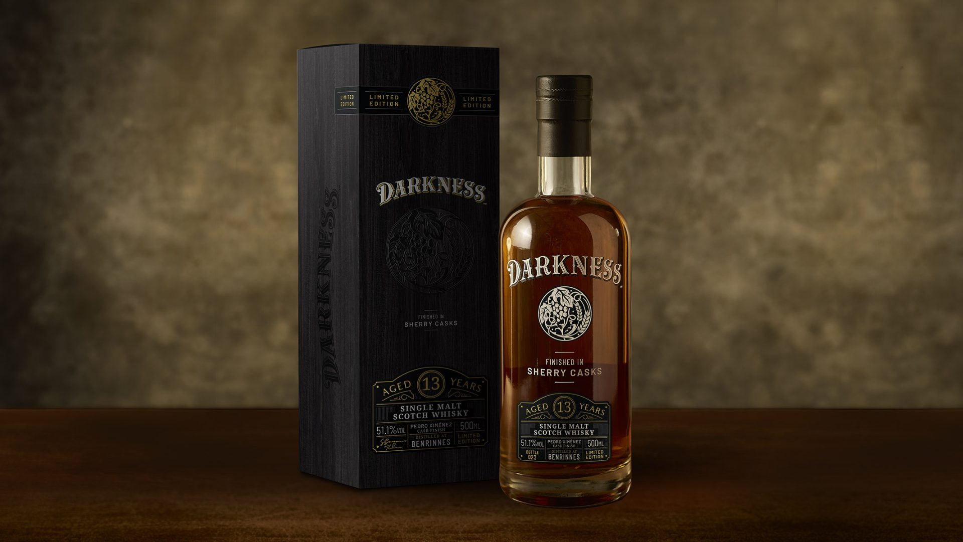
Whisky packaging design for Scotch brand Darkness.
Involvement
- Rebrand
- Brand development
- Label design
- Packaging design
- Marketing assets
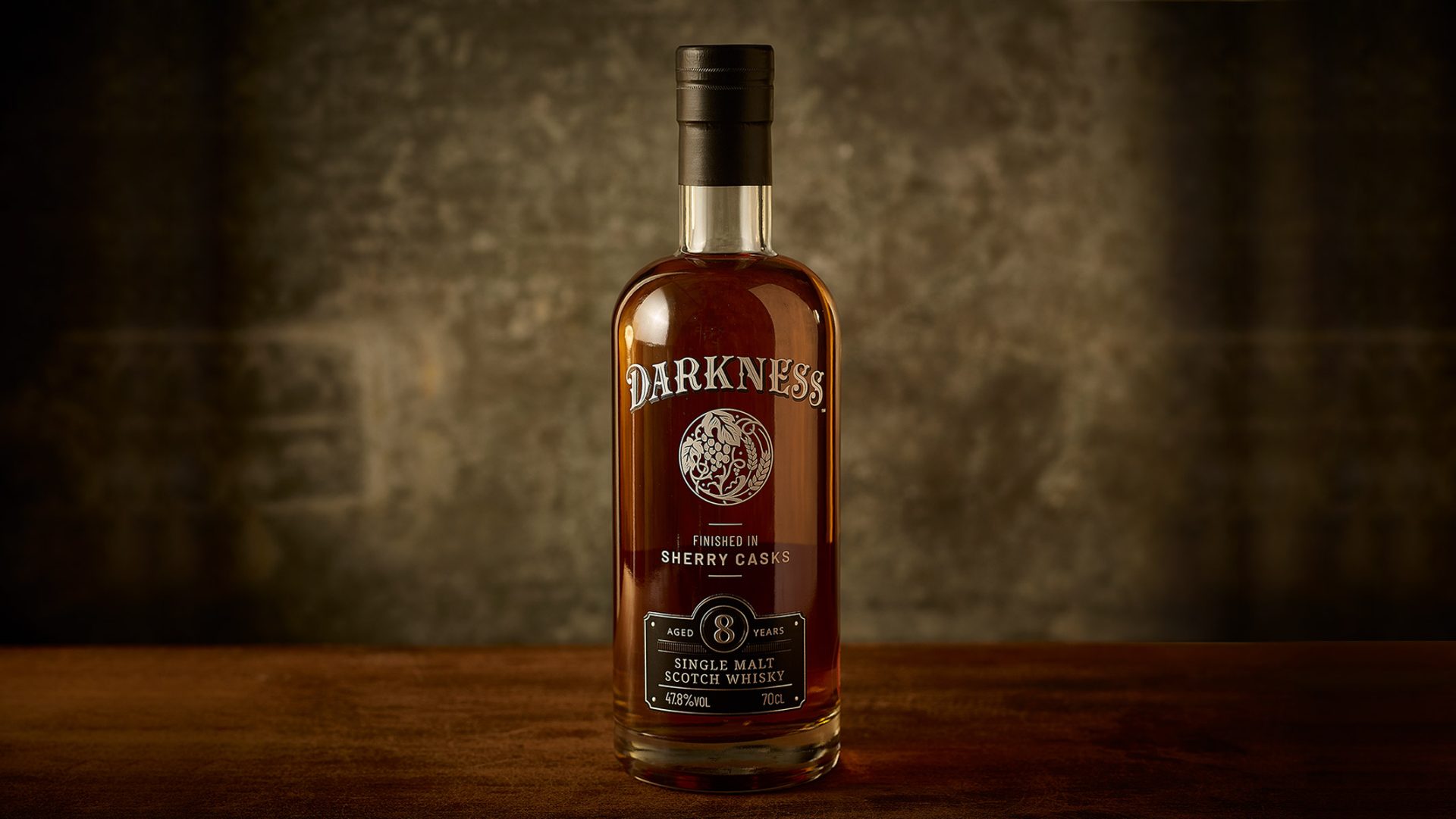
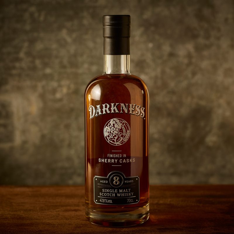
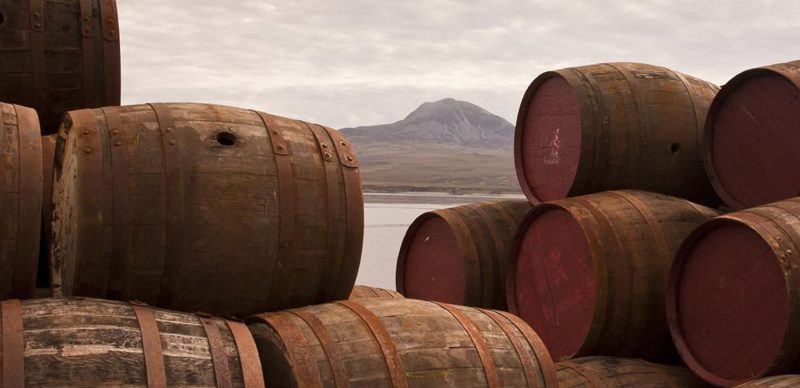
Whisky branding and packaging design for Darkness. A collection of intensely sherried single malt whiskies, which aimed to challenge the category with its richness and depth of flavour.
The design challenge
Darkness is renowned in the Scotch whisky realm for its intensely sherried whiskies and premium liquid quality. The challenge was to revamp the packaging in a modern and high-end manner to appeal to a younger demographic. Above all, the goal was to highlight the intense liquid colour, which was previously obscured by the large label.
Ultimately, the new design had to be versatile and suitable for future releases, including an 8-year-old continuous release and the limited edition cask range and premium gift box
The design solution
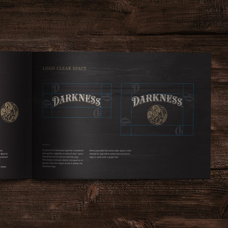
To enhance the bold essence of Darkness whisky, we simplified the existing packaging and refocused the design on its core strength: crafting rich, sherried liquid. We replaced the paper label with a screen-printed finish, which enhanced liquid visibility and showcased its beautiful colour and richness. We simplified the brand identity, allowing more breathing space. Additionally, we introduced a metal label to impart a luxurious and tactile feel. Coupled with refined typefaces and delicate brand elements, this further hinted at the maturation process.
Project completed via: Atom Group
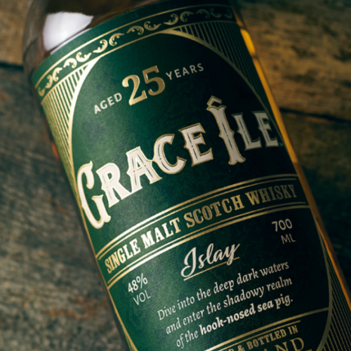
Drinks branding and packaging design for Islay Scotch Whisky brand.
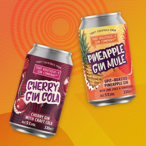
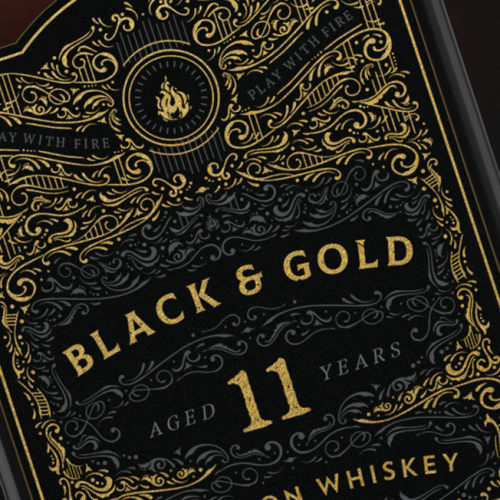
RTD drink packaging design and brand communication for a craft cocktail range.
Get in touch
Interested in finding out more or working together on a project?
I’d love to hear from you, lets talk about your project.
t: +44 (0) 7813 452100
e: hello@laracaiulodesign.co.uk